Showing posts with label Fine Art. Show all posts

Monday, 3 March 2014

Bruce McLean- 'Another Condition of Sculpture'

Leeds Art Gallery Friday 14th February- Sunday 11th May


The exhibition at Leeds Gallery is a thought provoking retrospective of the work of Bruce McLean, looking back over work produced during a fifty year period.

 The image above (Pose work of Plinths 1971) was my initial introduction to the artist as research for a project on line, space, and how humans interact with the linear. While McLean himself is often viewed as daring and mocking for this work, the attraction for me came from the humorous and unique ways in which the set space has been interacted with.

However, the ongoing exhibition focuses much more on McLean's drawn and painted mixed media pieces which really acted as an eye opener on the intertwining relationship between performance art, sculpture and drawing.
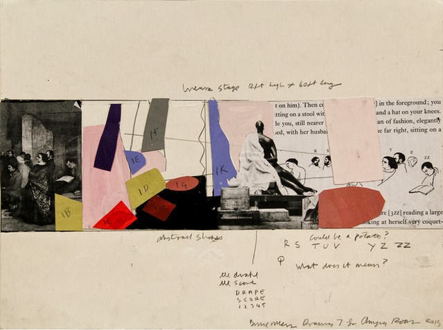
Changing Rooms 2013, was one of the series featured in the exhibition and particularly shows the contrast between McLean's early works and those of today. Changing Rooms itself is a new piece of live performance art that will take place in the gallery on the 8th May 2014, and the pencil, collage and photograph series act as an insight into the planning and mindset of the artist. Personally, these pieces are a lot more interesting to look at, as while technically simple, it is extremely insightful to see a visual representation of what can only start as an idea in the artists head. Instead of planning through the written word, McLean uses his art skills to further show an audience the process and thought behind his infamous live performance pieces.

Sunday, 5 January 2014

Bridget Riley- 'Winter Palace' - Leeds Art Gallery


Looking at Riley's painting from a distance, the first thought as a viewer is that the colours are a harmonious combination of blue, magenta, green and orange, and that the artist has succeeded in creating an aesthetically pleasing finished piece of work. However, after approaching the painting it became clear that there was a reason for the piece of work, which turned it from a 'pretty picture' into a valuable piece of fine art painting.

Inspired by a visit to Egypt between 1979 and 1981, Riley created a series of paintings based on the colours of the tombs that she had seen while there, and the name of this painting was inspired by the name of the hotel in which she stayed. What is so effective about her work is the incredibly simplistic nature of it. Based on colour samples from the places that she visited, she has managed to create work both with meaning and purpose and that is visually attractive, proving that sometimes meaning is a vital part of understanding art.

Monday, 25 November 2013

Turner Prize Nominee - Laure Prouvost 'Schwitters in Britain'

http://www.youtube.com/watch?v=8PF1KcGvJUw


Laure Prouvost was commissioned by the Tate to produce a piece of art for the 'Schwitters in Britain' exhibition to commemorate the life and work of Kurt Schwitter; a leading modernist artist. Kurt Schwitter while in exile between 1940 until his death in 1948, worked on a number of installation, architectural and sculptural pieces, including a series of 'Merz' barns, the last one of which was situated in the Lake District.

In response to the artist, Prouvost created an original mixed-media performance piece which revolved around the story of her fictional grandfather; close friend to the artist. To make her story believable and to try and help the viewer form a more personal and emotional relationship with Schwitter, she used projection, photography and even recreated the inside of the Cumbrian 'Merz' barn so that the viewer could interact in the scenery that once the artist himself was submerged in.

What is perhaps so interesting about the work is that she does not reveal to the viewer how much of her story is fabricated, which means that it is a personal choice how much you believe and are pulled into her fictional world. Therefore, the interactivity of her work is one of it's most successful elements, as it really engages the audience and helps them to build their own emotional bonds to an artist soon forgotten and overshadowed by the modern art world.

Dan McCarthy- Screen Printing


Dan McCarthy experiments with all forms of print-making to create stunning visual contrasts within his pieces and evoke a range of different feelings within a viewer.

The above image is one of McCarthy's more contemporary prints which overall portrays a more minimalist style than his earlier pieces. While he may be most widely known for his extremely detailed, intricate, layered prints, this style has a much more modernist edge to it, as each image features a black silhouette layered over a vivid yellow background. This is bold and striking to look at and creates an overall visually attractive effect.

Not only are the colour choices brave and aesthetically pleasing but the subject of the prints is also interesting to consider. McCarthy himself admits that he likes to focus on the unseen patterns, seeking beauty in things usually camouflaged in the urban environment. In this way, McCarthy is successful in creating unique art, using a process that can often be used to create quick, easy and uninspired pieces.

Tuesday, 15 October 2013

Rebecca Murtaugh- 'To mark a significant space in the living room'

"My studio practice engages an experimental and playful process... I often work within parameters, improvisation and intuition drive my actions in the studio along with a strong desire and consideration of beauty, form and colour."

Rebecca Murtaugh prides herself on taking an 'everyday' material of interest and using it to transform the 'everyday' space. What is unique about her work is that much of it is created within her very own home meaning that the final results are only seen in true form by a select few people, and therefore is only revealed to the masses through photographic medium.

The above image titled 'To mark a significant space in the living room' shows how she not only uses the form and texture of the post-it's but also invests a lot of her interest into their colours. She is known for using ordinary dull yellow post-it's for the less important objects in the background, and brings out the 'significant' objects; those vital to the function of each room in the more vivid colours available, such as blue, pink and green.


 The installation on the right was created by the artist in 2001 who covered her bedroom in $1000 worth of the sticky notes, it took six days to complete and was dismantled within a twenty four hour period of completion, with only five people seeing the finished result in her room. Similar to her living room piece, Murtaugh draws the eye to the objects that give a room it's function; particularly in this image the bed.

While the obvious reason to be drawn to the artists work is due to the visually pleasing aesthetics, she also makes a more valid point. The objects within a room determine it's function; without a bed, it would just be a room.

She admits her fascination with the object comes from how she has managed to manipulate it's function;
"They have purpose , but it's different for everyone: sometimes it's a note, 'I'll be back,' or maybe it's a phone number. But for all these important things, the note itself is always ephemeral and temporary... There is duality; it's disposable, but it's very valuable."
What is so admirable about Murtaugh is her persistence with the material; confining and restricting herself to the same media and purpose displays a diligence in her work, and the importance of the 'everyday' material to her as an artist.