Monday, 25 November 2013

BAF 2013 - 'The Kiosk' Anete Melece


'The Kiosk'; a seven minute animation about kiosk-owner Olga, did not fail to captivate viewers at the 2013 Bradford Animation Festival.

"Her story is about Olga, a very jolly and slightly lonely news-stand owner whose sweet tooth has left her so enormous that she can no longer squeeze out from her place of work, so is forced instead to spend her days inside reading travel magazines and daydreaming about the far-off lands she would love to visit." (http://www.itsnicethat.com/articles/animation-anete-meleces-the-kiosk-promises-a-playful-comment-on-daily-routine)
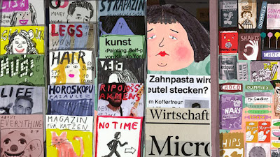

The short film, followed a light-hearted and playful narrative which left the viewer to appreciate the illustration and drawing skill without getting too involved in deep, considered meanings. Out of all of the short films, the style of this was perhaps most memorable because of the mixture of collaging, water-colour and felt tip drawings, that whilst only two dimensional managed to perfectly capture a familiar character, relatable to each of our lives.

Possibly most exciting to the viewer is how universal the short, simple plot is to all; each of us stuck in a daily schedule of work, and conforming to the monotonous routine of daily urban life, in dull, grey, familiar surroundings. Therefore, when Olga finally gains freedom from the oppressive constraints of city life, the viewer can only be glad for the 'happy ending.'

By choosing such a universally relatable subject, Melece is able to create an emotional response from the viewer and evoke personal memories or thoughts about their own lives or others around them.

Turner Prize Nominee - Laure Prouvost 'Schwitters in Britain'

http://www.youtube.com/watch?v=8PF1KcGvJUw


Laure Prouvost was commissioned by the Tate to produce a piece of art for the 'Schwitters in Britain' exhibition to commemorate the life and work of Kurt Schwitter; a leading modernist artist. Kurt Schwitter while in exile between 1940 until his death in 1948, worked on a number of installation, architectural and sculptural pieces, including a series of 'Merz' barns, the last one of which was situated in the Lake District.

In response to the artist, Prouvost created an original mixed-media performance piece which revolved around the story of her fictional grandfather; close friend to the artist. To make her story believable and to try and help the viewer form a more personal and emotional relationship with Schwitter, she used projection, photography and even recreated the inside of the Cumbrian 'Merz' barn so that the viewer could interact in the scenery that once the artist himself was submerged in.

What is perhaps so interesting about the work is that she does not reveal to the viewer how much of her story is fabricated, which means that it is a personal choice how much you believe and are pulled into her fictional world. Therefore, the interactivity of her work is one of it's most successful elements, as it really engages the audience and helps them to build their own emotional bonds to an artist soon forgotten and overshadowed by the modern art world.

Dan McCarthy- Screen Printing


Dan McCarthy experiments with all forms of print-making to create stunning visual contrasts within his pieces and evoke a range of different feelings within a viewer.

The above image is one of McCarthy's more contemporary prints which overall portrays a more minimalist style than his earlier pieces. While he may be most widely known for his extremely detailed, intricate, layered prints, this style has a much more modernist edge to it, as each image features a black silhouette layered over a vivid yellow background. This is bold and striking to look at and creates an overall visually attractive effect.

Not only are the colour choices brave and aesthetically pleasing but the subject of the prints is also interesting to consider. McCarthy himself admits that he likes to focus on the unseen patterns, seeking beauty in things usually camouflaged in the urban environment. In this way, McCarthy is successful in creating unique art, using a process that can often be used to create quick, easy and uninspired pieces.

Saturday, 23 November 2013

Eleanor Feddon- Contemporary embroidery


Eleanor Feddon uses textiles to create unique, contemporary pieces that push the boundaries of design and embroidery. Unlike a lot of textile artists, she is much more concerned with creating interesting shapes and bold striking designs through her bold use of colour . What is also interesting is her commitment to drawing and painting and the relationship that she keeps between this and her practical textile work. It is obvious to see her love of line and her drawings are always still vital to the formation of her final piece.
The devotion to creating new, exciting pieces shines through in her contemporary techniques and makes her work unique and inspiring.

Imaginary Forces - 'The number 23' opening sequence (2007)

Watch online: http://www.artofthetitle.com/title/the-number-23/

The opening sequence of 'The number 23' designed by the team at 'Imaginary Forces' features a mix of typography and blood spatters to create a series of simple, yet striking images.


The traditional typewriting font creates not only a universality but adds an ambiguous element as the simple and plain sequence doesn't reveal much about the nature of the film. However, this font combined with the crimson splatters is what creates the elusive element of fear, mystery and intrigue.

However, the opening sequence wouldn't be so effective without the clever use of the number '23' which is the focus of the film. They use the number to create visual patterns and sequences, as well as picking out important dates and numbers which all somehow add or relate to the title of the film.

It is also interesting how there is a strong relationship between the text and numbers; scrolling through numbers until the word forms in letters before disappearing again into a numerical sequence (e.g. Jim Carrey: J9M 31RR5Y).

All of these techniques create a visually exciting opening sequence, while using simple, blank backgrounds to not detract from the sense of ambiguity and striking effect that the use of typography creates.