Sunday, 15 December 2013

Chris Harrison 'Copper Horses' - The Bradford Fellowship in photography 2012-2013


Chris Harrison's 'Copper Horses' exhibition was a nostalgic journey spanning his fathers working career. What was so poignant about the exhibition was not the separate images themselves  rather the personal stories that were told. Talking about his work, Harrison expressed a desire to "instill a feeling of pride in the skill and creativity of ordinary people and what they do for a living." Whether this was achieved or not is questionable but he certainly succeeded in drawing the viewers to his father, perhaps more through the pencil anecdotes attached to his photographs, rather than the focus of the images themselves.

When viewing the exhibition, I couldn't help but feel a sense of loss that the industries that built strong, hard working communities together are no longer here. Instead, we are living in a country that has abandoned primary industries to develop more financially rewarding quaternary, specialist industries, while a large percentage of the population remain unemployed and on benefits. What Harrison manages to achieve through this exhibition is getting ordinary people to question and compare the direction that our country and industries are heading. Particularly through the exhibition being in Bradford, it hit a strong note. Bradford once a driving force in the industrial revolution, playing a huge part in the textile industry, has disintegrated like most other post-industrial areas of the north into social unrest and economic deprivation.

While Harrison was merely taking a personal journey into the life of his father, the overall questions raised about post-industrialised society were more important to me as a viewer, which I view as a success on his part; creating a real sense of joy, nostalgia and community looking back into the lost industrialised past of our country.


http://www.nationalmediamuseum.org.uk/PlanAVisit/Exhibitions/CopperHorses/About.aspx

Monday, 25 November 2013

BAF 2013 - 'The Kiosk' Anete Melece


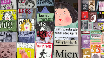
'The Kiosk'; a seven minute animation about kiosk-owner Olga, did not fail to captivate viewers at the 2013 Bradford Animation Festival.

"Her story is about Olga, a very jolly and slightly lonely news-stand owner whose sweet tooth has left her so enormous that she can no longer squeeze out from her place of work, so is forced instead to spend her days inside reading travel magazines and daydreaming about the far-off lands she would love to visit." (http://www.itsnicethat.com/articles/animation-anete-meleces-the-kiosk-promises-a-playful-comment-on-daily-routine)


The short film, followed a light-hearted and playful narrative which left the viewer to appreciate the illustration and drawing skill without getting too involved in deep, considered meanings. Out of all of the short films, the style of this was perhaps most memorable because of the mixture of collaging, water-colour and felt tip drawings, that whilst only two dimensional managed to perfectly capture a familiar character, relatable to each of our lives.

Possibly most exciting to the viewer is how universal the short, simple plot is to all; each of us stuck in a daily schedule of work, and conforming to the monotonous routine of daily urban life, in dull, grey, familiar surroundings. Therefore, when Olga finally gains freedom from the oppressive constraints of city life, the viewer can only be glad for the 'happy ending.'

By choosing such a universally relatable subject, Melece is able to create an emotional response from the viewer and evoke personal memories or thoughts about their own lives or others around them.

Turner Prize Nominee - Laure Prouvost 'Schwitters in Britain'

http://www.youtube.com/watch?v=8PF1KcGvJUw


Laure Prouvost was commissioned by the Tate to produce a piece of art for the 'Schwitters in Britain' exhibition to commemorate the life and work of Kurt Schwitter; a leading modernist artist. Kurt Schwitter while in exile between 1940 until his death in 1948, worked on a number of installation, architectural and sculptural pieces, including a series of 'Merz' barns, the last one of which was situated in the Lake District.

In response to the artist, Prouvost created an original mixed-media performance piece which revolved around the story of her fictional grandfather; close friend to the artist. To make her story believable and to try and help the viewer form a more personal and emotional relationship with Schwitter, she used projection, photography and even recreated the inside of the Cumbrian 'Merz' barn so that the viewer could interact in the scenery that once the artist himself was submerged in.

What is perhaps so interesting about the work is that she does not reveal to the viewer how much of her story is fabricated, which means that it is a personal choice how much you believe and are pulled into her fictional world. Therefore, the interactivity of her work is one of it's most successful elements, as it really engages the audience and helps them to build their own emotional bonds to an artist soon forgotten and overshadowed by the modern art world.

Dan McCarthy- Screen Printing


Dan McCarthy experiments with all forms of print-making to create stunning visual contrasts within his pieces and evoke a range of different feelings within a viewer.

The above image is one of McCarthy's more contemporary prints which overall portrays a more minimalist style than his earlier pieces. While he may be most widely known for his extremely detailed, intricate, layered prints, this style has a much more modernist edge to it, as each image features a black silhouette layered over a vivid yellow background. This is bold and striking to look at and creates an overall visually attractive effect.

Not only are the colour choices brave and aesthetically pleasing but the subject of the prints is also interesting to consider. McCarthy himself admits that he likes to focus on the unseen patterns, seeking beauty in things usually camouflaged in the urban environment. In this way, McCarthy is successful in creating unique art, using a process that can often be used to create quick, easy and uninspired pieces.

Saturday, 23 November 2013

Eleanor Feddon- Contemporary embroidery


Eleanor Feddon uses textiles to create unique, contemporary pieces that push the boundaries of design and embroidery. Unlike a lot of textile artists, she is much more concerned with creating interesting shapes and bold striking designs through her bold use of colour . What is also interesting is her commitment to drawing and painting and the relationship that she keeps between this and her practical textile work. It is obvious to see her love of line and her drawings are always still vital to the formation of her final piece.
The devotion to creating new, exciting pieces shines through in her contemporary techniques and makes her work unique and inspiring.

Imaginary Forces - 'The number 23' opening sequence (2007)

Watch online: http://www.artofthetitle.com/title/the-number-23/

The opening sequence of 'The number 23' designed by the team at 'Imaginary Forces' features a mix of typography and blood spatters to create a series of simple, yet striking images.


The traditional typewriting font creates not only a universality but adds an ambiguous element as the simple and plain sequence doesn't reveal much about the nature of the film. However, this font combined with the crimson splatters is what creates the elusive element of fear, mystery and intrigue.

However, the opening sequence wouldn't be so effective without the clever use of the number '23' which is the focus of the film. They use the number to create visual patterns and sequences, as well as picking out important dates and numbers which all somehow add or relate to the title of the film.

It is also interesting how there is a strong relationship between the text and numbers; scrolling through numbers until the word forms in letters before disappearing again into a numerical sequence (e.g. Jim Carrey: J9M 31RR5Y).

All of these techniques create a visually exciting opening sequence, while using simple, blank backgrounds to not detract from the sense of ambiguity and striking effect that the use of typography creates.


Tuesday, 15 October 2013

Rebecca Murtaugh- 'To mark a significant space in the living room'

"My studio practice engages an experimental and playful process... I often work within parameters, improvisation and intuition drive my actions in the studio along with a strong desire and consideration of beauty, form and colour."

Rebecca Murtaugh prides herself on taking an 'everyday' material of interest and using it to transform the 'everyday' space. What is unique about her work is that much of it is created within her very own home meaning that the final results are only seen in true form by a select few people, and therefore is only revealed to the masses through photographic medium.

The above image titled 'To mark a significant space in the living room' shows how she not only uses the form and texture of the post-it's but also invests a lot of her interest into their colours. She is known for using ordinary dull yellow post-it's for the less important objects in the background, and brings out the 'significant' objects; those vital to the function of each room in the more vivid colours available, such as blue, pink and green.


 The installation on the right was created by the artist in 2001 who covered her bedroom in $1000 worth of the sticky notes, it took six days to complete and was dismantled within a twenty four hour period of completion, with only five people seeing the finished result in her room. Similar to her living room piece, Murtaugh draws the eye to the objects that give a room it's function; particularly in this image the bed.

While the obvious reason to be drawn to the artists work is due to the visually pleasing aesthetics, she also makes a more valid point. The objects within a room determine it's function; without a bed, it would just be a room.

She admits her fascination with the object comes from how she has managed to manipulate it's function;
"They have purpose , but it's different for everyone: sometimes it's a note, 'I'll be back,' or maybe it's a phone number. But for all these important things, the note itself is always ephemeral and temporary... There is duality; it's disposable, but it's very valuable."
What is so admirable about Murtaugh is her persistence with the material; confining and restricting herself to the same media and purpose displays a diligence in her work, and the importance of the 'everyday' material to her as an artist.

Tuesday, 8 October 2013

Lorna Simpson - Stereo Styles

Camera Austria (International)
123, 2013

"Simpson is asserting the historical reconfiguration of the photographic archive, but also that of art and memory."

Stereo Styles, 1988. 10 Polaroid prints, 10 engraved plastic plaques.
Photographs 35 x 31 inches each, plaques 3 x 6 inches each, 66 x 116 inches overall.

 Lorna Simpson's 'Stereo Styles' consists of ten images focusing on the back of a head; each featuring a unique hairstyle. Accompanying the images there are also ten descriptive words that each invoke a different feel or emotion about the photographs; ‘Daring,’ ‘Sensible,’ ‘Severe,’ ‘Long and Silky,’ ‘Boyish,’ ‘Ageless,’ ‘Silly, ‘Magnetic,’ ‘Country Fresh,’ and ‘Sweet.' While Simpson herself as a feminist photographer intended to make the audience judge through these phrases, and portray how people jump to conclusions about a person without even seeing their face, it also adds a humorous element; ironic considering the serious social  meanings of her collection.

While the message that she portrays is meant to prove a point about sexism and racism, the viewer finds themselves more drawn to the image because it appears to be 'fun' and 'playful;' happen not dissimilar from portraits seen in magazines. Also, the words on the black plaque add an element of interactivity to her work as the viewer attempts to match up the descriptions with the hairstyles.

Whether intended or not, it is interesting to think about how different people would respond to the images, and whether they are received as serious and meaningful as intended or just as interesting to look at.

Friday, 4 October 2013

Bruno Michaud (BMD design) - 'Scriptography'

Novum -  World of Graphic Design,
International Issue German/English October 2013
Article 'Vintage Ink' by Marta Almeida

"Scriptography is the art of combining, meeting, merging, marrying, blending and mixing texts and drawings. It s a kind of graphic alchemy." - Michaud


The title of Almeida's article in the 'Novum' graphic design journal seems to summarise the whole concept of BMD. 'Vintage Ink' perfectly describes their work concisely, in just two words. Unlike a lot of modern graphics, Michaud prides himself on using a number of different processes to create authentic and rustic looking pieces which incorporate the main features of graphic design as it has evolved through time, building and working ino each piece with different media until he has created a classic and bold result.

The image above is an excellent example of the type of work that is produced under his company. As Almeida points out in her article; Michaud's preference for handwriting 'evokes a nostalgia,' a yearning for the simplicity of writing, text and communication in the past. He creates this appeal through combining processes; lettering created through painting with watercolour, combined with thick ink and ballpoint pen to create sharp, bold outlines as well as a 'harmonious' balance between the bold image and text.

What is so exciting about Michaud's work is that in a world obsessed with technology, minimalism and modernism, his designs appeal to the mass. This represents the timelessness of classic graphic design work and directs thoughts back to an age before computers.

Tuesday, 1 October 2013

Toshiko Horiuchi MacAdam- "Takino Rainbow Nest"

ETN Textile Forum
3/2013 September copy


Part of the 'fiberarts' movement, Toshiko developed her love of experimentation; specifically how art can have a practical and interactive use. She has displayed a number of her installations across Japan which have all incorporated this theme and were composed from a combination of both hand crocheted nets and large machine-knotted nylon nets.

Jean Littlejohn- 'Portal'

Embroidery- The Textile Art Magazine
September/October 2013


"Jean's work is largely about the passing of time, often combining aspects of pattern with history."

Jean Littlejohn's most recent textile artwork was largely inspired by the renovation of her Victorian  home. While work was being completed, Jean gained ideas from peeling back the layers of plaster and wallpaper and studied the interesting textures and patterns surrounding her.

The 80x40cm image above ('Portal') was created through a combination of printing, layering, hand and machine stitch as well as embellishing. The subtle colours, all tints of originally bolder colours, help to create a sense of the past; the patterns are still visible but have faded over time. Her use of layering also mimics the build up of patterns and textures on the walls through the years that it has been inhabited.

Although as a flat 2D image on the internet it is hard to gain a real sense of the textures on the piece, the layering still somehow manages to hint at the raised surfaces so you can visualise how it may feel to touch. The careful consideration of colour means that although composed of numerous layers of pattern, it is not chaotic or overpowered by the different textures.

Wednesday, 25 September 2013

The Colors News Machine - Jonathan Chomko

 Computer Arts- Design Matters
October 2013, Issue #219


At first glance, the Colors News Machine appears to be a sculpture, or piece of artwork that incorporates varying media equipment designed to process and relay information to the public. However, not only is it very captivating to look at but it has also been designed as a functional machine to mirrior the spread of gossip and portray how news is distorted, changed and censored before it reaches the eyes of the public.

The machine itself is an interactive installation, which processes a tweet, throughout a series of media equipment to create a 'Chinese whispers' effect. The overall work focuses much more on the concepts behind it than the visual appeal and revolves around the theme of processing information and the mistakes that happen along the way.

There is much debate about whether the piece can actually be classed as a piece of 'artwork' more than a mechanical invention. However, it shows the direction that art is beginning to take in a world reliant on the processing and transferral of information. Interactivity is becoming a big part of 'art' and the success of the piece is that the viewer themselves can see an input that they have created, become distorted into something different in front of their eyes.

Tuesday, 24 September 2013

'Dalston Anatomy' - Lorenzo Vitturi

Interview by Steve Pill featured in British Journal of Photography
September 2012, volume 160, Issue #7816

'Dalston Anatomy' is a collection of photographs inspired by the bustling Dalston's Ridley Road Market in East London. Vitturi's work often features the vibrant colours found in the market to create visually intriguing pieces that give you a real sense of the different cultures surrounding him.

There are three obvious steps to each of Vitturi's final pieces in the collection. Initially he will seek out something aesthetically vibrant and attractive from the market itself to use as the starting point. In this case the photograph on the right was his inspiration. Occasionally, Vitturi will then embellish prints of his photograph using objects or vivid colour pigments to add another dimension to the work.  He then collects materials; whether it be food or fabric from the market, that relate to the colours and textures visible in the initial photograph and creates temporary sculptures and installations which will only stand for as little as a few minutes. His final piece then becomes a photograph of his work, as this is the only way that the sculpture can be seen for a period of time.

Tuesday, 17 September 2013

'Broken Hill'- Pratchaya Phinthong

Art Monthly- September 2013 issue 369
Artist profile written by Eliza Williams

"Talks by museum guides are often a distraction, getting in the way of directly experiencing the work itself. But in Thai artist Pratchaya Phinthong’s exhibition, the guide’s talk is the work."(TimeOut- http://www.timeout.com/london/art/pratchaya-phinthong-broken-hill)

Pratchaya Phinthong takes a very historical and political slant to artwork, collecting inspiration from world travel and and important cultural tales. His exhibition at London's Chisenhale gallery was motivated by an important part of Zambian history and was created as 'the end result of a long process of discovery.'

Phinthong's original interpretation of the issue 'what is art?' defies conventional practice as while he encourages participants to take an active role in his work, he is often seen to take a back seat approach. His 'Broken Hill' exhibition provides a perfect example of this interactive artwork. As 'TimeOut' recognise in the quote above, it is in fact Kamfwa Chishala, a guide from the Lusaka National Museum in Zambia who becomes essential to the performance piece; carrying the audience on a historical and eye-opening journey of discovery.

As the profile in 'Art Monthly' reveals; the skull was first discovered in Zambia, 1921 by miners but was transported to London by colonial authorities and later became so important that it was used as evidence to support Charles Darwin's work. The skull used in the exhibition therefore is actually a replica made for the Lusaka Museum and is the piece that Chishala talks so passionately about. This brings into question an interesting concept and is possibly the main idea running throughout Phinthong's exhibition; the blurring between a real artifact and a false replica. Phinthong proves the point that the replica skull is held in higher regard and is therefore more sacred and appreciated than the real one (which is hidden away in London's Natural History Museum). It expresses the view that belief, culture and heritage run stronger than what the eye can see. Just knowing that the real does exist creates enough intrigue for an audience to dismiss the fact that what they are viewing is a fake. The replica has become more meaningful to the Zambian people than the original skull which Phinthong helps the viewer to understand by using Kamfwa Chishala.

Phinthong's strength is his ability to be an artist simply through informing the wider world about what he discovers on his travels. He is able to explore challenging concepts simply by stepping back and 'inviting others to become active participants in the shaping of his art.'

Monday, 16 September 2013

'Weathering Scape' - Tomoko Abe.

Article by Leigh Taylor Mickelson
Ceramics: Art & Perception - 2013 Issue 92
http://ceramicart.com.au/

"Tomoko Abe's approach to clay in many ways echoes our relationship with nature.... Abe works with clay's natural tendencies and, with skilled manipulation and patience, she starts a dialogue with clay... then she see's where it takes her"
 Mickelson effectively sums up how artist Tomoko Abe approaches her work with clay in the above quote. While traditionally, public perception of clay art may be restricted to figurines and vases, Abe manages to modernise the media and create exciting and expressive pieces. The natural material works in a particularly effective way in relation to the wild 'weathered scape' theme and has been uniquely manipulated by the artist to create stunning and intriguing pieces.

The image on the left (courtesy of Pelham Art Center) is an installation called 'View of Beneath the Rain'  and is a mixed media piece created by porcelain casting, plaster and abaca paper and is  measured at 5'8" by 3'8". When seeing the piece in its 3D form (http://www.youtube.com/watch?v=iiQN__59fLU) and observing the movement of the projections and light, the image creates a sense of timelessness and shadow, mimicking the abstract shapes that raindrops create on a surface.